
Designing a computer science course
Table of Contents
NOTE: This post is a component of a larger reflection blog post on my time as an instructor for CMU's 15-150 Principles of Functional Programming course. That blog post can be found here.
Designing a course from scratch is a lot of effort. It involves creating a itinerary of topics, a comprehensive narrative that drives the material, homework assignments that will be challenging enough to nurture students' growth while remaining feasible, and a great deal of investment into each individual student.
Thankfully, this blog post is not about that. Having finished my stint as a summer instructor for 15-150, the introductory functional programming class at CMU, I was able to work off of course material that had already been taught for years. There was no need for me to design a whole curriculum from scratch.
But, even though the pure information content of the course was predetermined, an important lesson that we derive from the film Megamind is that there is one aspect which separates an instructor from a super-instructor:

With information comes the presentation of that information, and with presentation comes stylistic choices. With those comes a whole other world of issues and challenges, because information may be immutable, but how it is conveyed to someone can make a world of difference in how it is retained, remembered, and understood.
This blog post is about designing a course, in the sense of artistic design. It's an exploration of how, over twelve weeks and months of preparation, I attempted to create a comprehensive style that could not just present material to students, but engage their attention fully, primarily through the creation of visual content for students to refer back to in the form of slides.
Why does design matter?
Once thing which I took away from my undergraduate education is just how hard it is to capture people's attention. This was witnessed firsthand by myself, as I spent probably over 70% of my time in college lectures asleep.
Having taught students before as a TA, I know that teaching students who don't want to be taught is impossible. I also know from experience with myself, that the only way that I can be engaged with content is when the content is itself engaging. Design matters.
I'm something of a visual learner, in that when I see a very well-done diagram, I remember that diagram. I am more incentivized to look at graphics when they are pretty -- I am more incentivized to look at slides when they are pretty. My goal was to create a set of slide decks that would truly cause people to pay attention.
One interesting corollary of this is that, because I chose to present my slides live during lectures, I needed slides that I could teach a lesson to. At the same time, however, I knew that 150 did not have a textbook, and that students needed referenceable material so that they could study adequately. There existed lecture notes, but they were typeset and drab, and I wanted to do better.
So my goals for my lecture slides were threefold:
- They needed to be structured in a way such that I could teach a lesson to them, without students losing focus or tabbing out. This means that I could not simply dump text on them--they needed to feel dynamic.
- They needed to be helpful to people who are studying the lecture after the fact, and be as referenceable and helpful as a textbook on the subject. In essence, my slides need to serve as the textbook for the course.
- They needed to be thematically consistent, in terms of having predictable structure that would cause students to be able to build the right conceptual understanding.
Similarly to how leitmotifs in music are recurring musical elements which highlight a particular idea or character, I had a few consistent visual themes that I would use in my slides. My belief is that similar information should be presented similarly, visually, becuase it ultimately creates material that is easier to follow along.
Design Themes
Color Palette
One such way this manifested was in the color schemes for each slide deck. Each slide was characterized by a primary color palette and a secondary color palette. The primary color is usually a fairly bold color that characterizes the borders and backgrounds of the slides, and the secondary color is a sometimes contrasting, also bright color which is used for highlighting purposes. I did not come up with this idea, but I acquired it when I inherited Jacob Neumann's slides, a previous 150 instructor.
One such way I used this idea was in terms. This was my term (haha) for vocabulary words, or instances of terms which I do not think that students would have encountered before. Essentially, important words. These would be highlighted in the secondary color, always, which would tell students that they should be paying attention.

These colors would also be used in each slide's syntax highlighting, as well as to color certain blocks, which denote things like key facts, definitions, examples, and mantras. Ultimately, these colors served as lightweight visual cues, meaning "hey, pay attention".
Title Slides
Presentation matters a lot, and it matters most at the beginning of a lecture. How can you draw someone's attention in in the first minute, and make them excited for the lecture that is to come? You need to have a great first title slide. First impressions matter.
Traditional title slides done in Beamer (the LaTeX set-up I constructed my slides in) typically all look quite similar, with a presentation name in some colored box, and with authorship information scattered elsewhere.
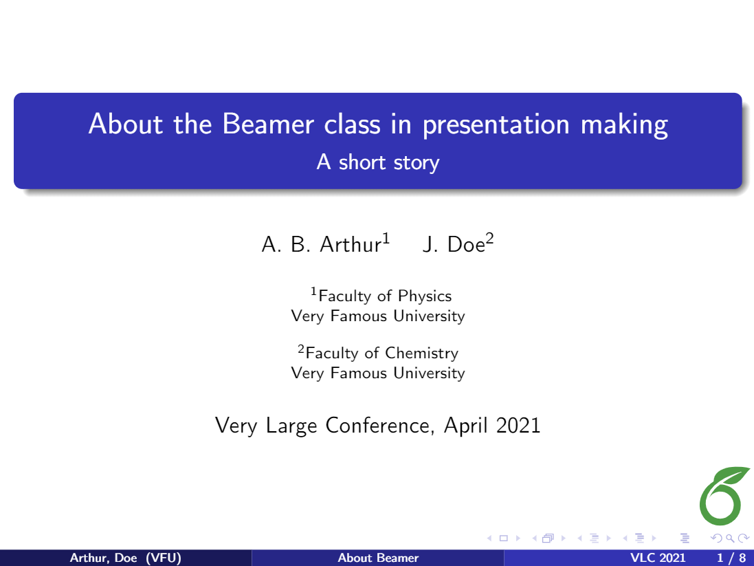
This is tried and true, but puts me to sleep. I wanted something which might stick in their brains, which would announce the subject material in a dynamic way. I needed something more personalized to the course.
With the help of my friend Boro, a designer at Semgrep, we came up with a rough prototype of a template that could be filled in for each lecture:

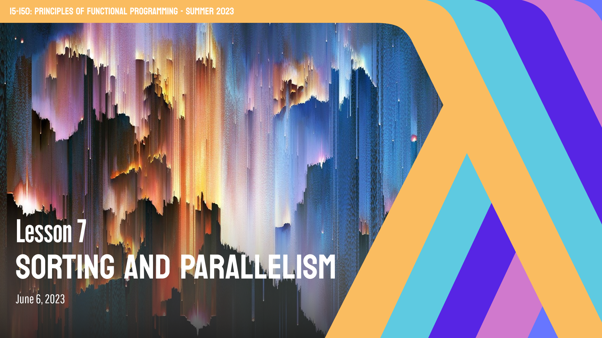
With a little polish and fine tuning, we arrived at our final template:

There were a few constraints I had to contend with to get here:
- I wanted to have a lambda on it somewhere, hopefully obvious and prominent.
- I wanted to have a background image, which would hopefully add some contrasting detail to the simplicity of the lambda. The obvious solution was to place the lambda at the right, and have it frame the background image, which would take up the rest of the space.
- An artistic choice was to have it be multiple lambdas, all folding in to each other, in order to evoke a sense of recursion, or neverendingness. These lambdas would be colored differently, to give a more nuanced color palette to the slide deck.
- We resolved the awkward "tail" at the top of the lambda by stretching it across the top of the border with a horizontal line. This also gave a convenient place to announce the title of the course.
- This left only on top of the background image, for the lecture title and other metadata to go. This can be problematic, though, as white text is not easily visible on all kinds of backgrounds. This was resolved with Boro's suggestion to place a gradient background above the background image, which fades to black as you get farther down. It's hard to notice if you aren't looking for it, but makes the text much easier to see.
For the background image, I usually chose something I found visually interesting which would moderately relate back to the content of the lecture. For instance, for the asymptotic analysis lecture, I chose a mountain, which I thought was an appropriate representation of something which grows seemingly neverendingly. For the lecture on parallelism and sorting, I chose a stylized representation of a sorting algorithm that I found on Google, which worked out quite well.

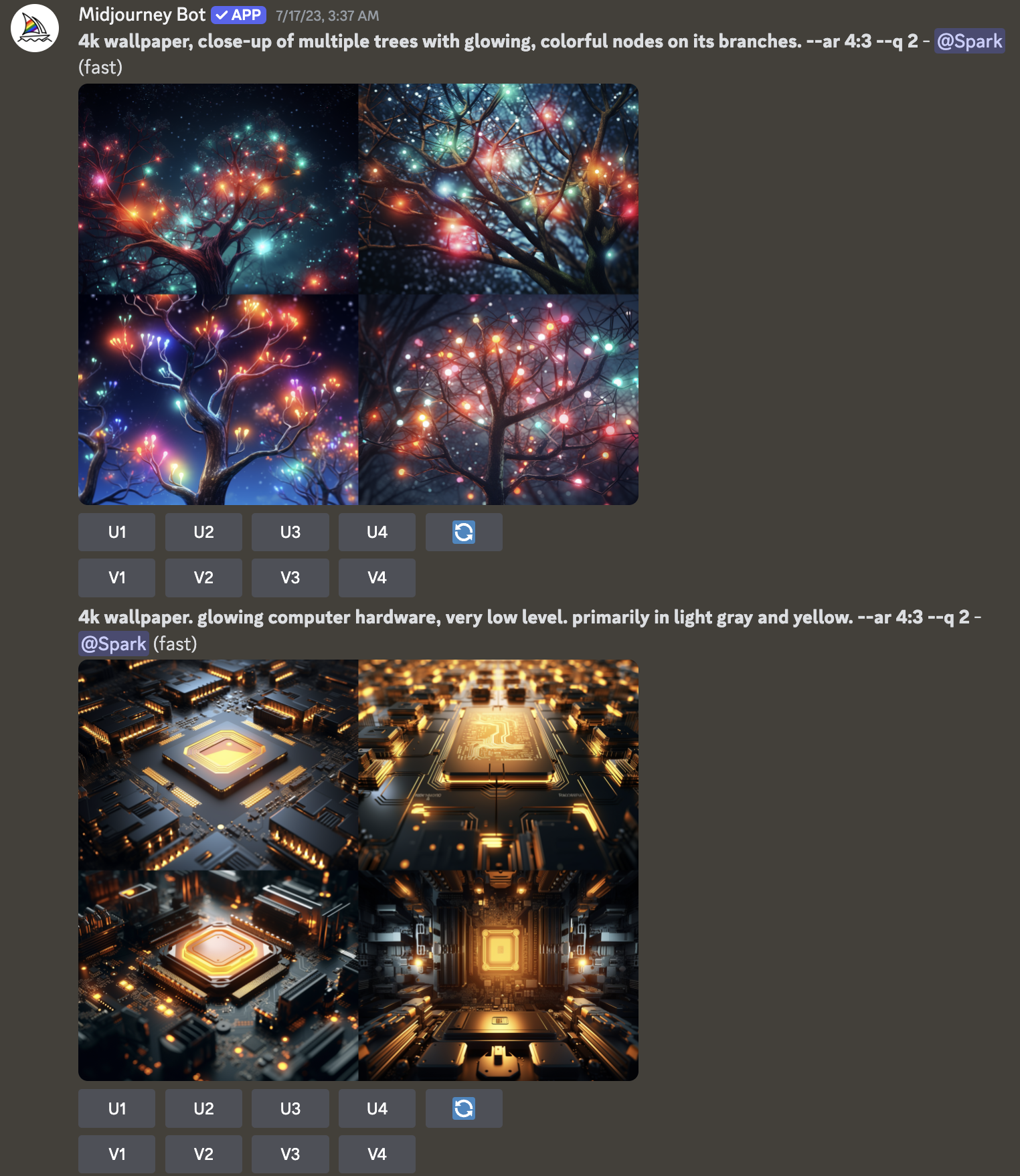
For later lectures, this stopped working out as much. For things like functors, higher-order functions, and sequences, it's actually incredibly hard to find a good-looking picture which somehow relates back to that topic. At this point, I was having trouble finding good premade pictures online, so like any other engineer in 2023, I decided to fall back to AI tools.
The premier online prompt-to-image generation tool at the time was Midjourney, which I made copious use of during the course. It turns out that usually it's fairly easy to come up with some abstract idea of what I want the slide image to represent, but hard to find someone who has already specially created such an image. Midjourney bridges that gap nicely, as for most such things I can think of, I can just do a bit of prompt engineering to get it to display what I want.
For instance, the CPS background image above is actually generated by Midjourney, and represents a classic way of teaching CPS that I have been using for years, by imagining the growing lambda expression of the continuation as a "donut", or layered circle. I was very happy with this result.
Theses
To highlight the lessons being taught in the course, before the course ever began I came up with three theses that I wanted students to be able to concretely take away from the course. They were Recursive Problems, Recursive Solutions, Programmatic Thinking is Mathematical Thinking, and Types Guide Structure.
I knew that I would often forget to bring up the Three Theses at later points in the course, but I didn't want it to feel like a vapid, first-day detail that would never show up again. I truly do believe that the three theses are fundamental to the course, and in consolidating meaningful takeaways from it, so there needed to be a way to integrate it into each lesson.
I knew I wanted a visual cue to indicate when a thesis applied, but how would this be achieved? I could denote it in an inline colored block, as I did with other significant details, but this felt like a different kind of importance. It wasn't a definition, key fact, or vocabulary term, it was more of a motif or reoccurring idea. Writing it in the main canvas of the page felt like it would take away too much from the content of the lesson. I needed somewhere with unused space.
I ended up being able to find a solution, in placing the badge of the thesis in the title bar, to the left of the lambda that accompanied every slide:

This worked out fairly well, with the exception of slides which had exceptionally long names, which tended to conflict with the long name of the thesis Programmatic Thinking is Mathematical Thinking.
Diagrams
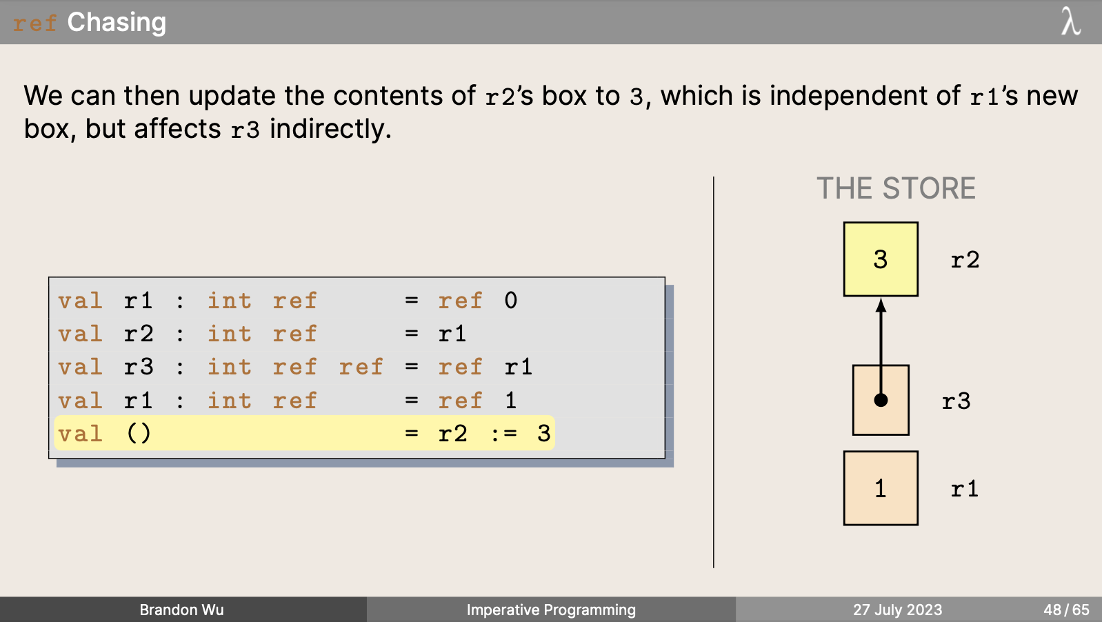
Stylized text is one thing, but the aspect of visual presentations I think is most important is in the diagrams.
You can make words as pretty as you'd like, but that doesn't change the fact that they are words. This can help with incentivizing someone to read them, which is better than them not being read at all, but you are limited to the inherent ability of words to transmit information, which is sometimes lacking.
A picture is worth a thousand words, so when it came to my lessons, I made sure that if I could present something visually to a student, I would have an interesting, stylized diagram for them. I find that I am something of a visual learner, and even if I don't recall the precise details, the "imprint" of a well-done diagram can stay with me for years.
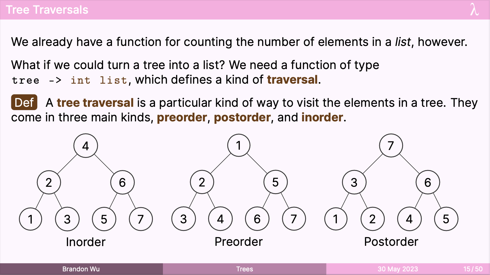
One diagram I got a lot of use out of involved a hierarchical lattice:
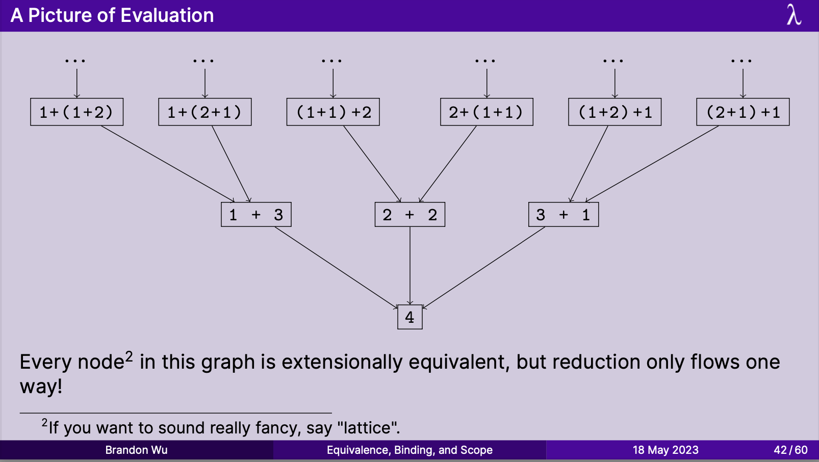
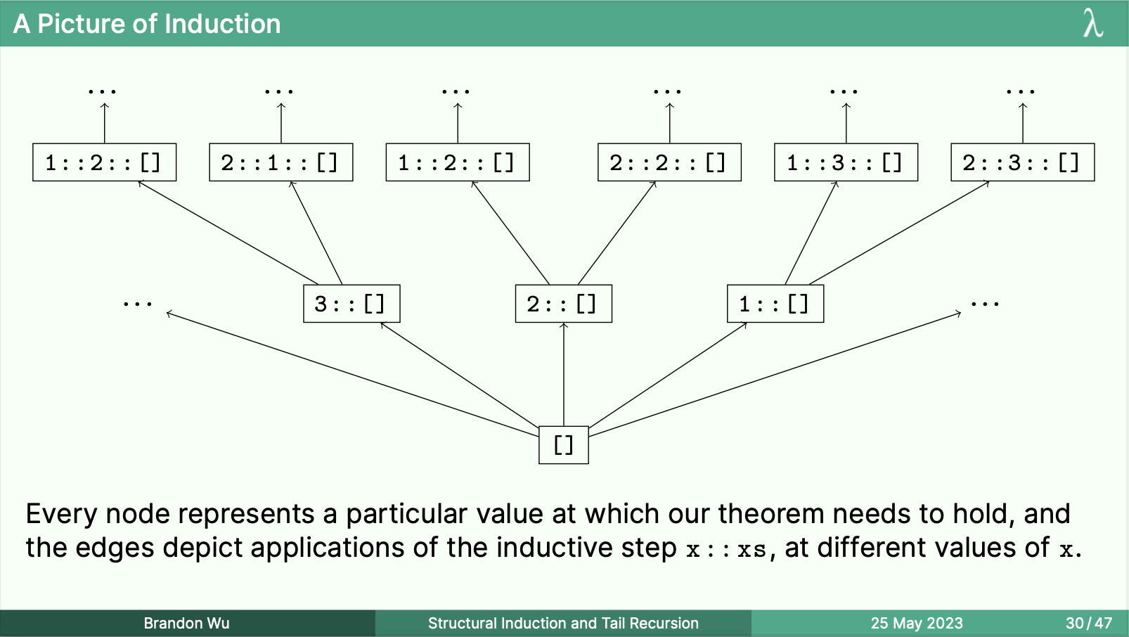

I believe that, if you have this pictorial idea of knowing that you can think about things like induction, subtyping, and evaluation in this way, it only takes a little bit more thinking to rederive the whole thing from scratch. I personally benefit a lot from having this intuition.
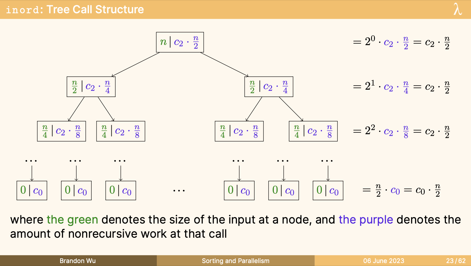
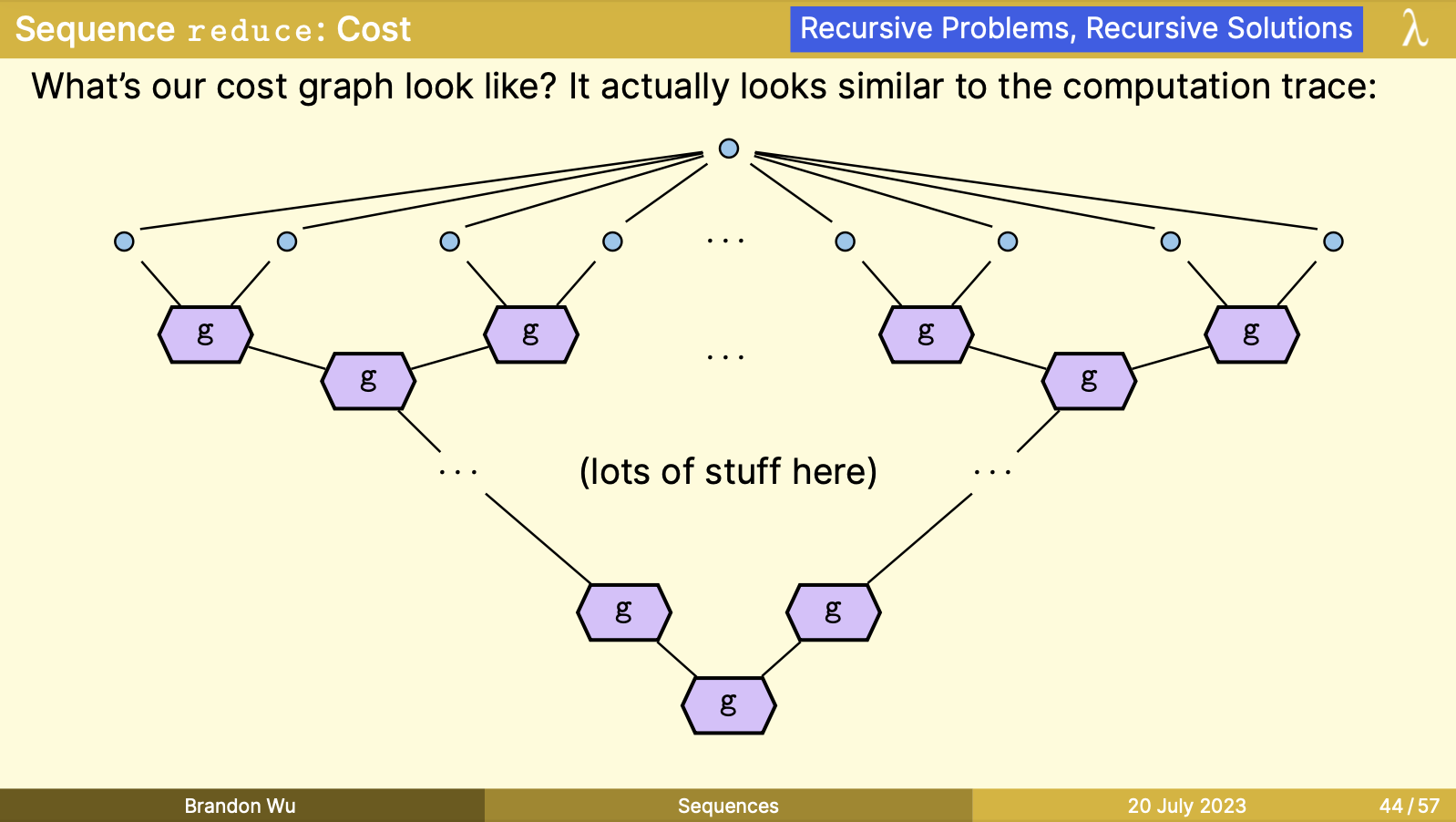
Case Study: Lecture 17 - Sequences
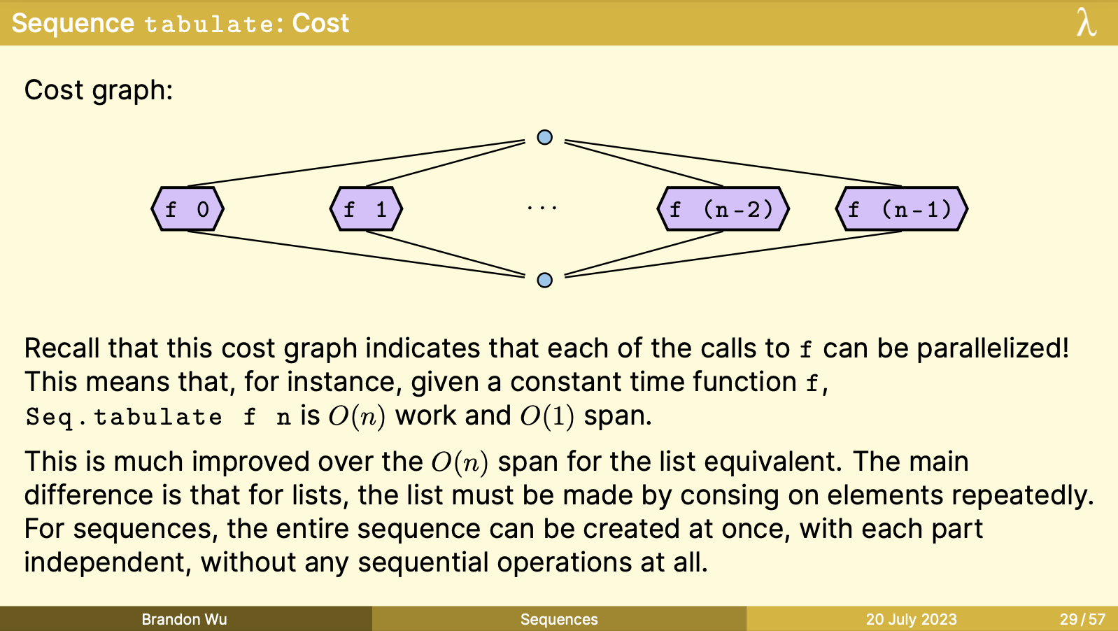
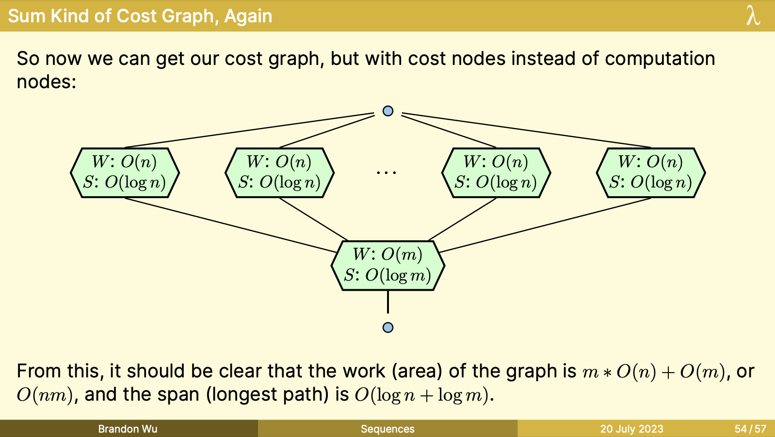
For this lecture, I knew that having a nice-looking representation of cost graphs would go a long way to making them palatable. The typical 150 notes on cost graphs have them as ASCII graphs with typeset characters, which is fine for comprehension, but not something that particularly engaged me when I was a student.
Two ways that this manifests are in shapes and colors. These are the dimensions that I have an advantage in, versus the typeset example. I knew I wanted to take advantage of these.
For the fundamentals of cost graphs, I reused the core idea of having sequential and parallel composition of graphs be denoted by singular or branching edges. The joins and nodes were mostly where I had some freedom.
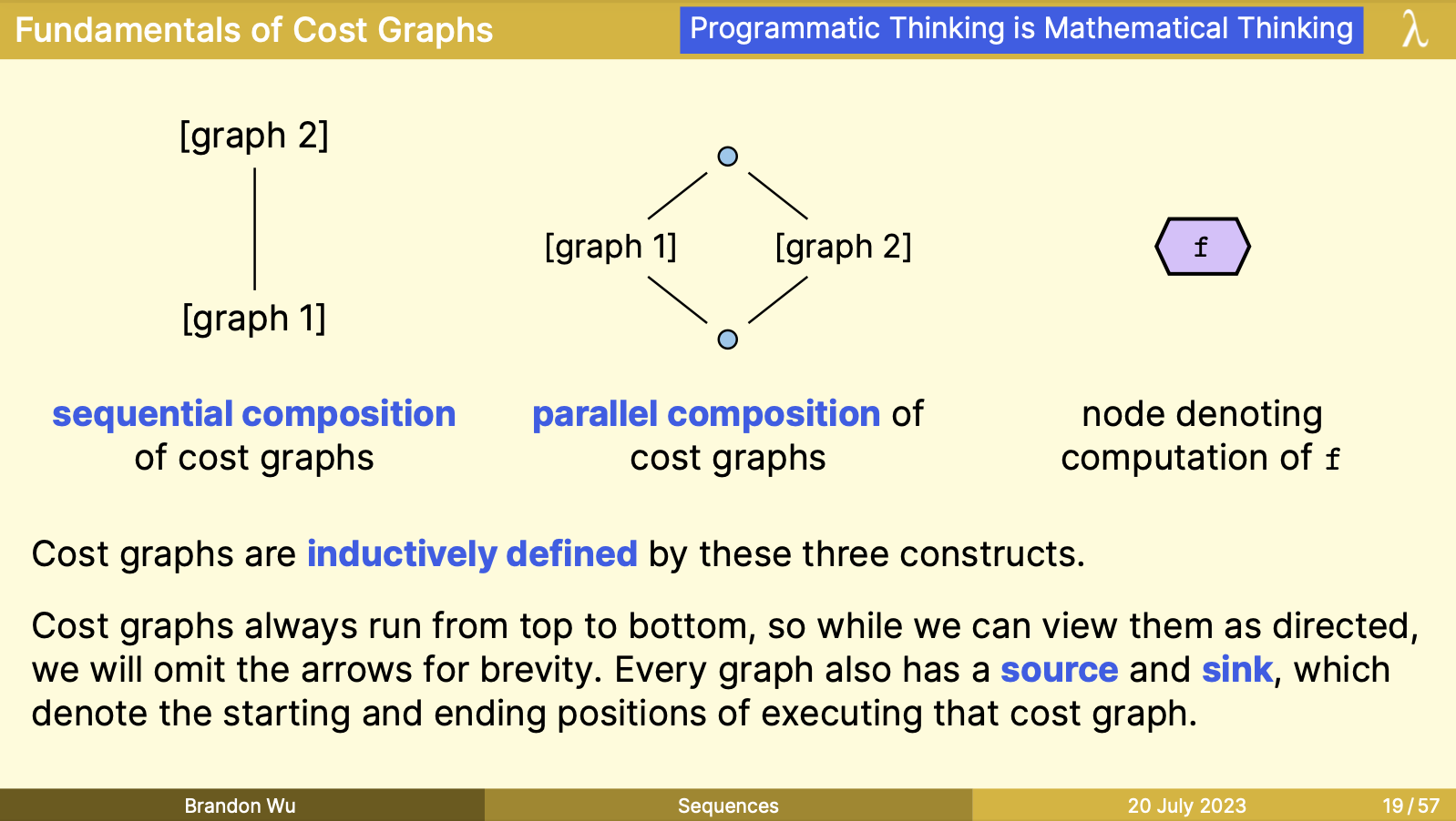
When joined together into a real cost graph, I wanted a distinction between the fundamental units of the graphs themselves, and a kind of "syntactic sugar" for a terse representation of a larger sub-graph. This gave way to the distinction between "computation nodes" and "cost nodes", in purple and green respectively.
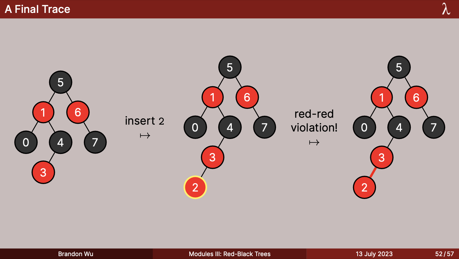
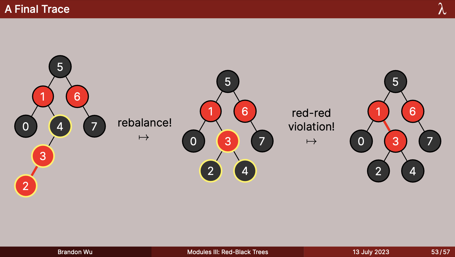
Case Study: Lecture 16 - Red-Black Trees
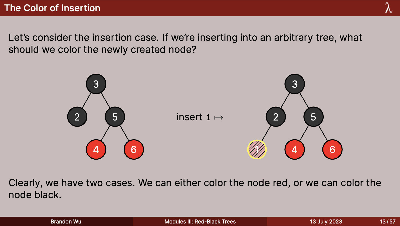
Red-black trees are the final boss in terms of graphics. The importance of colors is literally in the name of the data structure, so I needed to step up my tree game, which historically took the form of just uncolored circles on the normal slide background.
One thing which stood out to me about this problem was how to represent a sense of dynamicness, in the sense that red-black trees are often characterized by the way that their shape changes over time. How do I reflect that dynamic behavior over time in a static, 2D image, without the reader getting confused and forgetting where we came from?
To facilitate this, I made use of highlighted nodes, which consisted of a yellow border around particular nodes that I wanted to point out, for instance when inserting a node. When the color of a node was unclear, I also used a kind of TBD node, which had a not-quite-red patterned background, to signal that its color had yet to be determined.
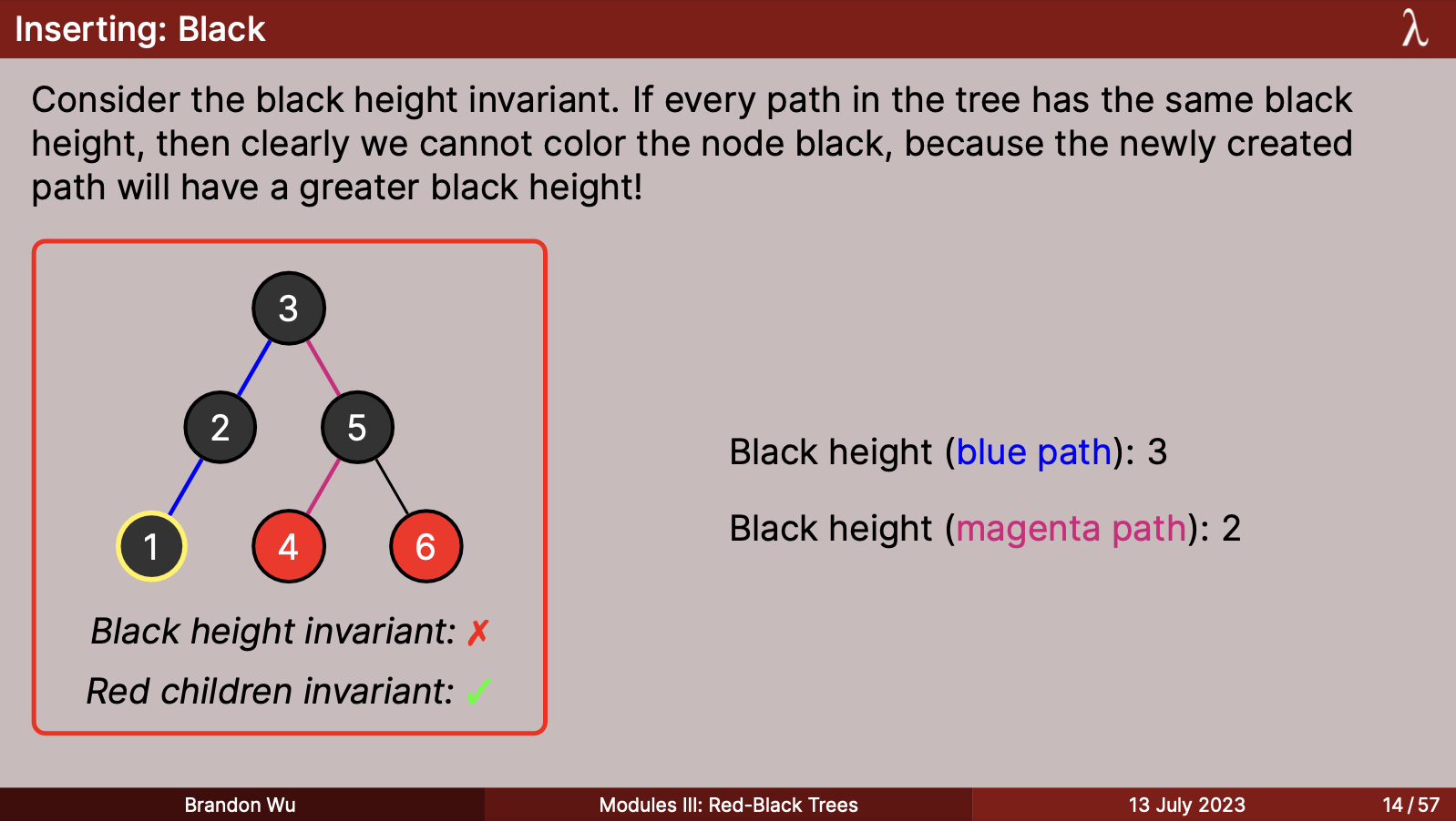
When it came to red-black tree invariants, I also wanted to be able to quickly visually indicate whether a given tree satisfied the invariants or not, without needing to take up paragraph space by just writing it out with words. This led me to a common design I used, which was to place the tree into a red or green slightly beveled box, which indicated the invariants which were satisfied (or not).
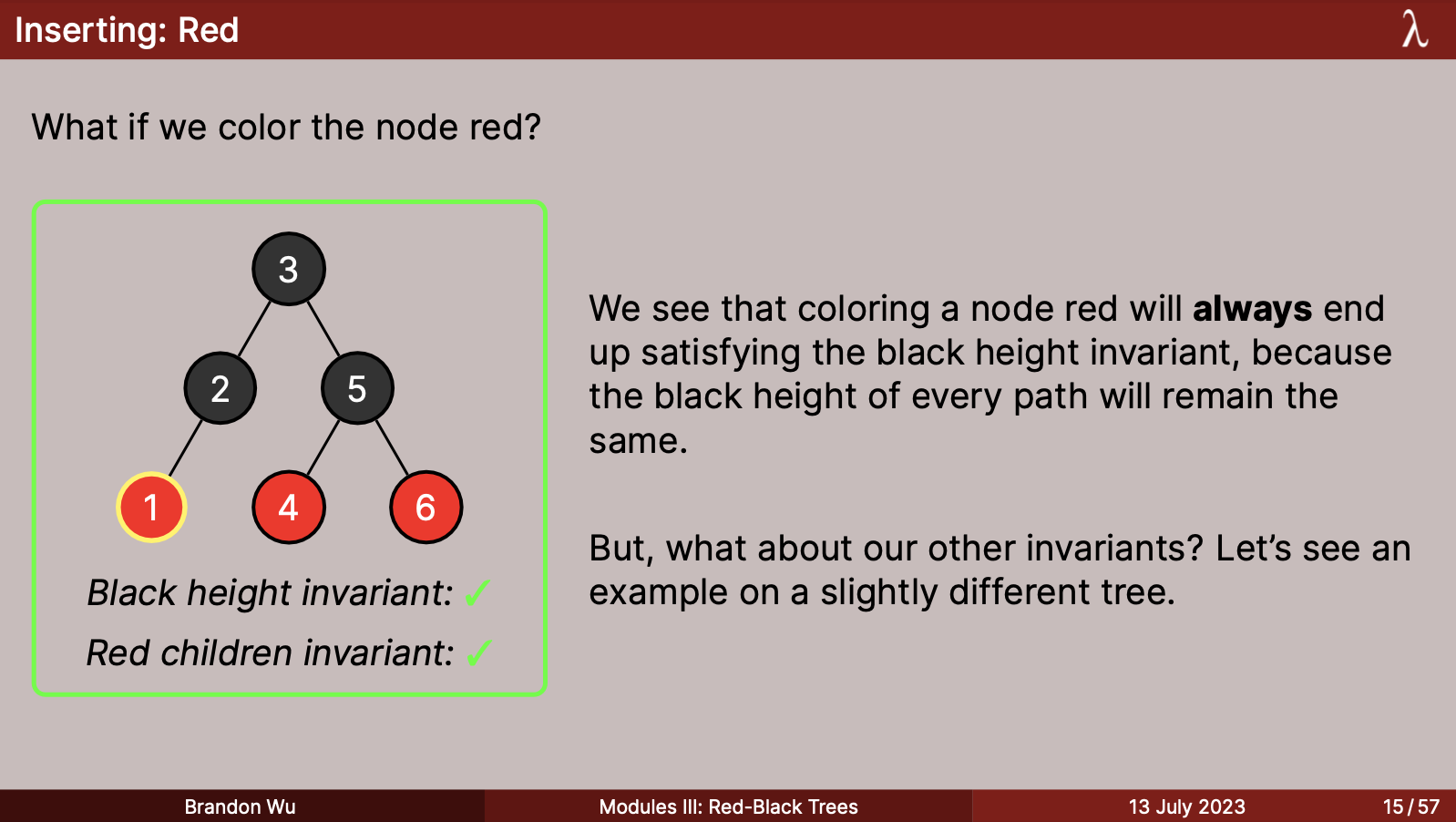
This led me to traces where I was satisfied with how you could tell the "diff" from the previous image, by seeing the added highlighted parts. The highlighted nodes also came in useful to identify the "triads" of nodes which were to be rebalanced.
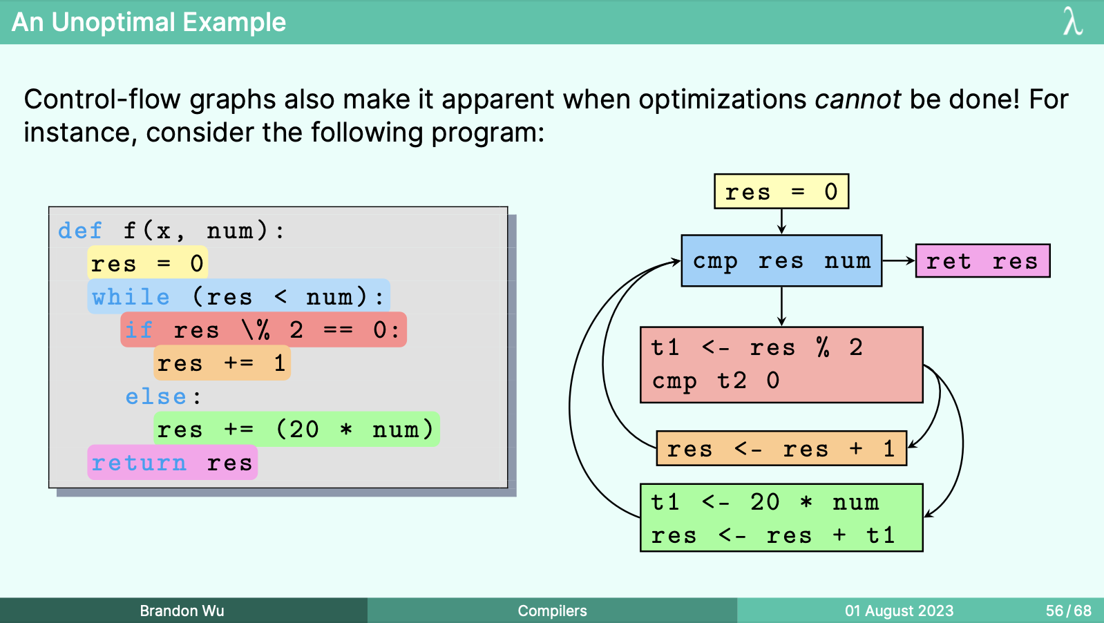
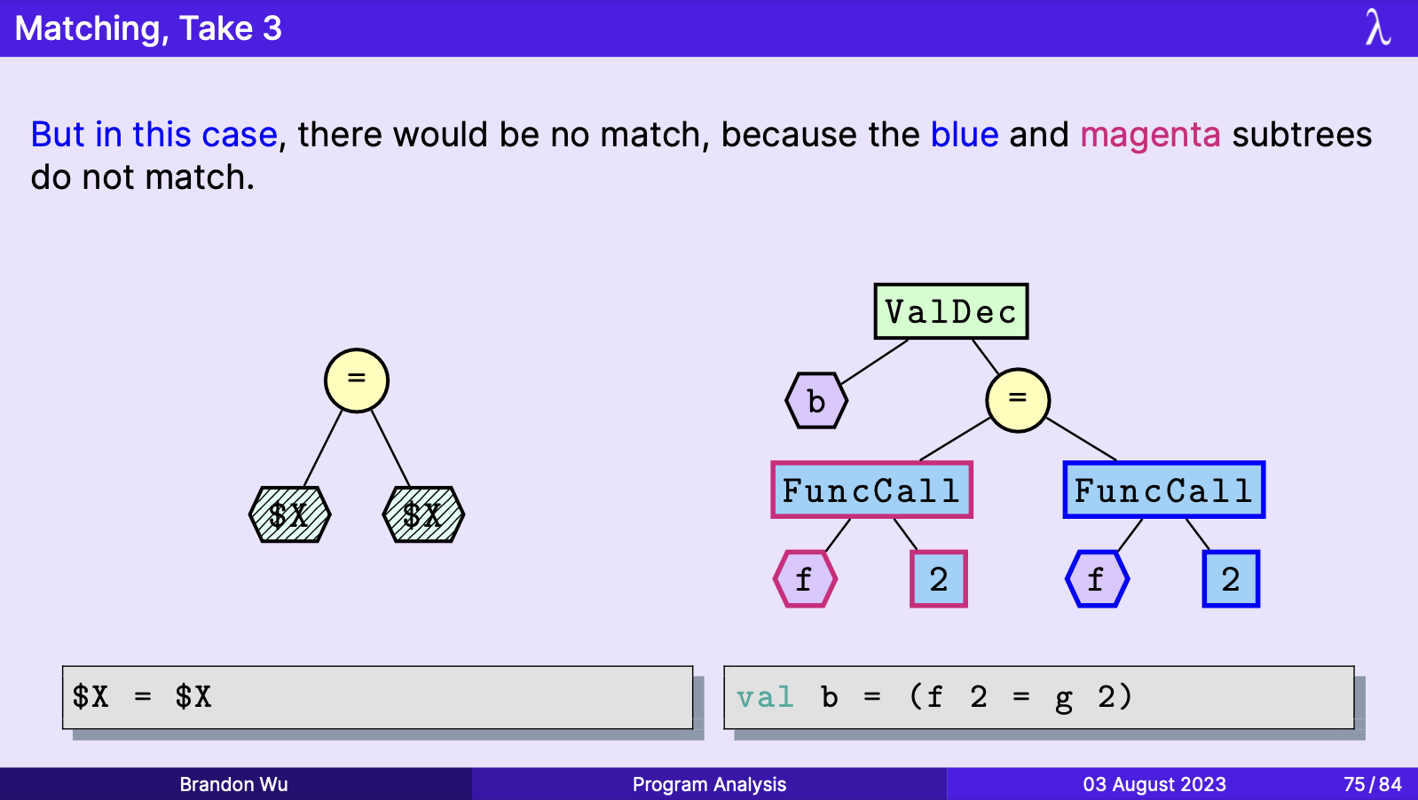
Here's a gallery of a menagerie of diagrams that I am particularly proud of:
Final Thoughts
Overall, the graphics and attention to small details in my course took up the majority of my time when creating content. While not a stipulation imposed upon anyone other than myself, I found that creating visually appealing content, like tail recursion, was its own kind of reward.
At the conclusion of the course, I wanted to make one last synthesis of the designs that I had constructed over the course of the semester, as a keepsake to put in my room. With some help from my friend Gabriel, we came up a poster for my iteration of the class:
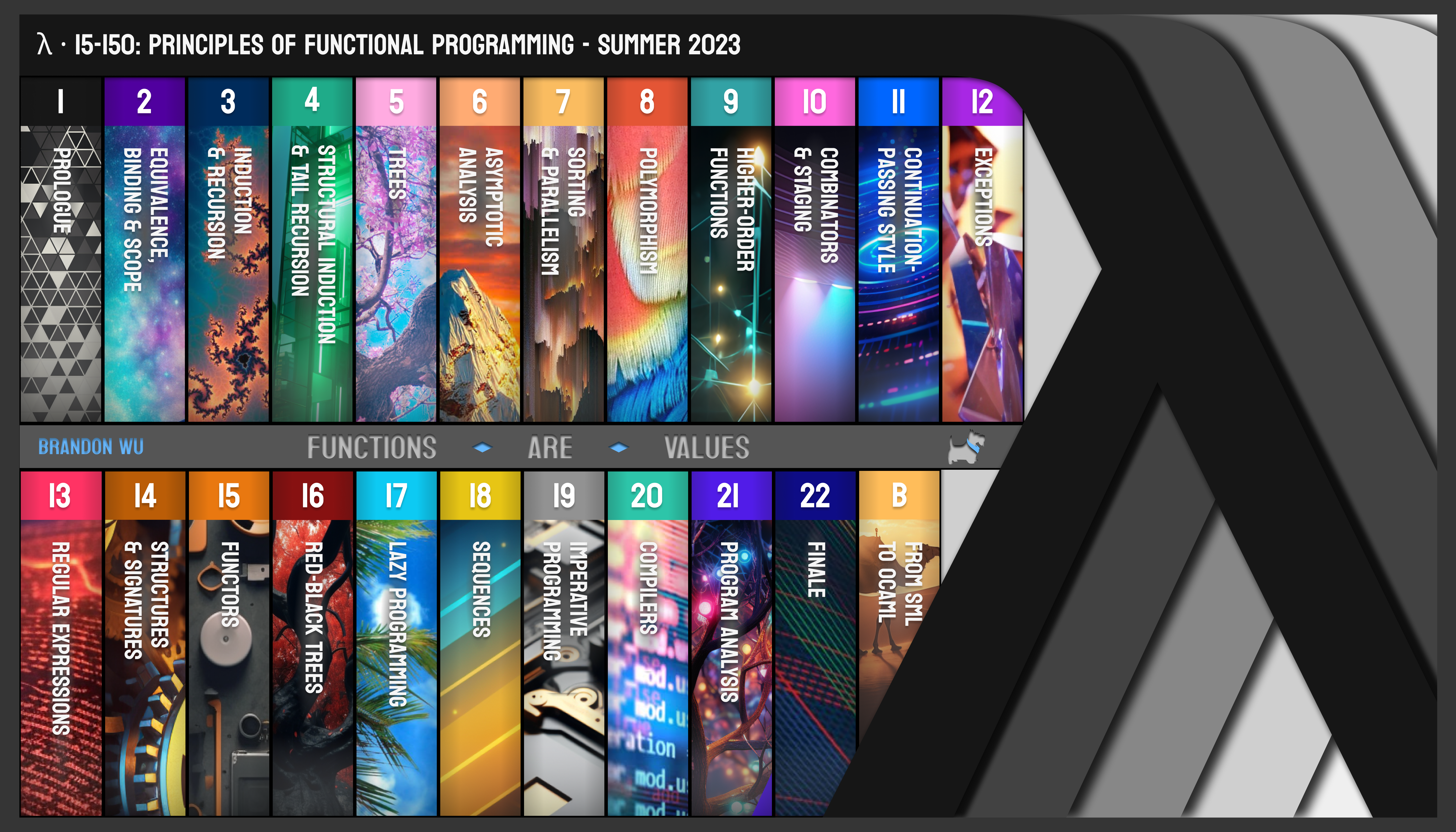
I was very happy with this, and consider it the capstone of the effort I put into this semester, in terms of aesthetics.
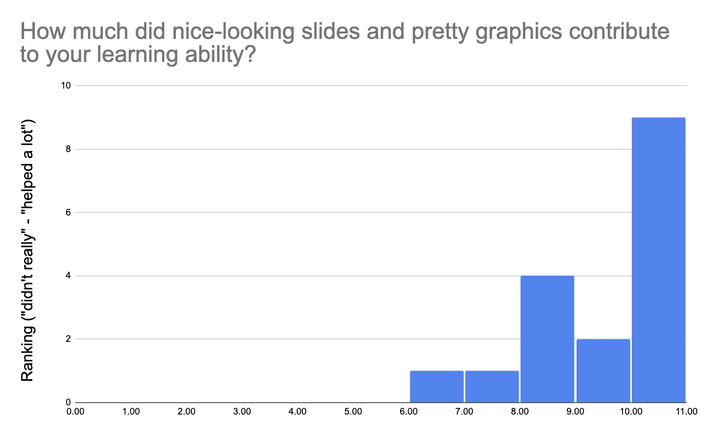
It's not the case that my sense of aesthetics was the only beneficiary of this work, though. During the course, I received much feedback that the attention to detail in the slides and its visually appealing nature was greatly appreciated by students, and that it helped them to pay attention and be interested in the material.
That's all you can really ask for, at the end of the day.